Recreation of Minard's chart of Napoleon's 1812 Russian campaign
In my INFO 526 - Data Analysis and Visualization course, we were given the following task in our first homework assignment, along with three small datasets containing information on the cities, temperatures, and troops:
The instructions for this exercise are simple: recreate the Napoleon’s march plot by Charles John Minard in ggplot2.
I chose not to follow a tutorial/guide for this. Through lots of trial and error I came close to the original (albeit without the elegance of exterior troop labels):
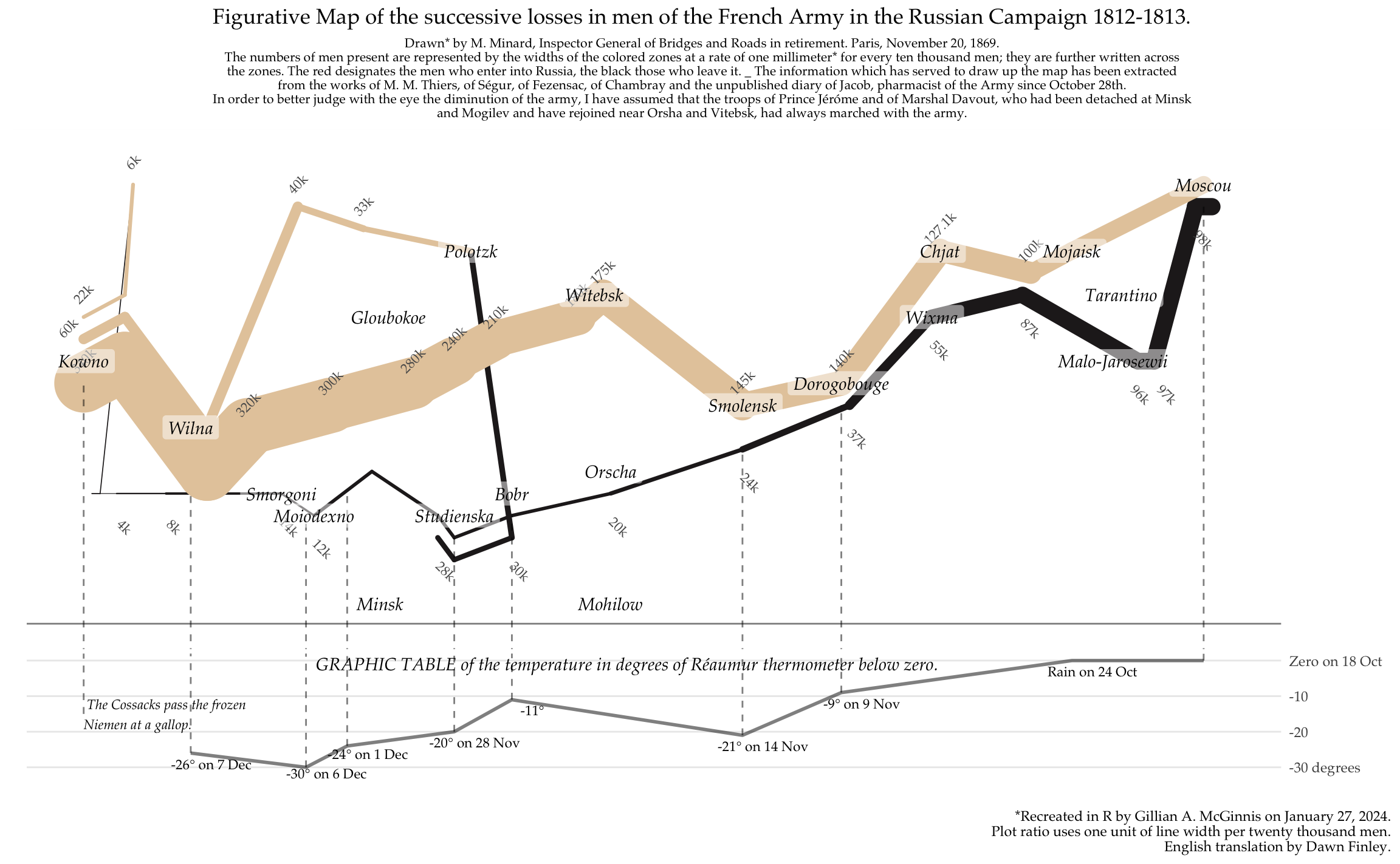
In total, this clocked in at 176 lines (128 within the actual ggplot()). Needless to say, lots of theme settings were applied to minimize ink and match the original.
Differences from Minard’s original are as follows:
- Included negative sign on the Réaumur axis; excluded 5 °R breaks.
- Shortened troop annotations using kilo format (e.g., 1.000 = 1k).
- Rounded troop paths.
- No rivers (not included in data set).
- Dashed lines for temperature annotations.
- Month in English abbreviation rather than numeric and Roman numerals.
- Adjusted ratio of black:tan (retreat:advance) soldiers at the Niemen; Minard has it drawn as 1 to 28 when in reality it was 1 in 45 (Tufte, p. 127).
Potential improvements with more/adjusted data:
- Inclusion of river markers; these were important in Minard’s original because they also marked sections of troop loss (most noticeably at the Berezina and the Mohilow which are labelled on the above visualization but not distinctly marked).
- Troop size representation: the data has the starting march split into 340k, 60k, and 22k in order to allow for better grouping, but this visually gives the appearance of separated troops.
In the future I may choose to post my code & instructions for this recreation, but in the meantime I will simply let this speak for itself. I look forward to others’ interpretations.
Resources
- “The Fundamental Principles of Analytical Design” (pp. 122-139), Beautiful Evidence by Edward Tufte (2006)
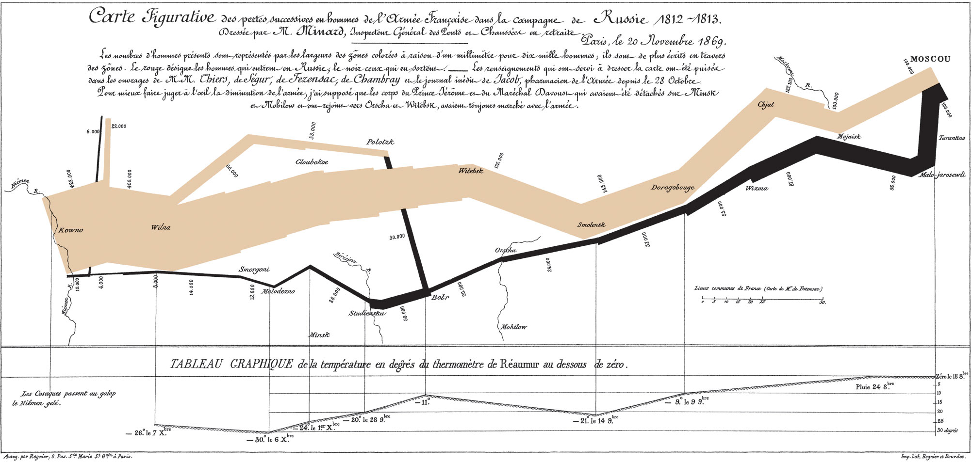
- Figurative map reference:
- Originally designed by Charles Joseph Minard (1869)
- In English: Translated by Dawn Finley and redrawn by Elaine Morse in Beautiful Evidence pp. 123-124.
- Digitized on Wikipedia: scan (2008) and redrawn (2021)