STAD Visualization Overview for Monitor Host Cohort Meeting
The following was originally a handout I created for an NCA (Neighbors for Clean Air) monitor cohort meeting.
Data visualization tools for PurpleAir monitors
Gillian McGinnis and Juliane Fry
Reed College
Summer 2021
Project overview
PurpleAir has developed an excellent low-cost particulate matter (PM) sensor with a convenient online mapping tool (https://www.purpleair.com/map). This online visualization tool is primarily focused on real-time mapping of air quality, but is limited in terms of small-scale cross-comparisons, the inclusion of external data (e.g., traffic patterns; wind direction/intensity; population data) and the analysis of seasonal averages, historical data, or special cases (such as holidays/events).
This summer, we are writing scripts in the open source R language (https://www.r-project.org/about.html) on the corresponding RStudio data analysis platform (https://www.rstudio.com/) to expand on existing tools to analyze the data and create clear visualizations. We aim to provide well-documented and reusable tools that can be used to encourage environmental health literacy by enthusiasts and general community members alike.
Since visualization is a powerful method of representing data, we aim for our tools to be clear in interpretation, unbiased in their presentation, and accessible, all while also being visually appealing to users. Careful considerations will be made with the final visualization tools, such as ease of readability, colorblind-safe palettes, and clear labels and annotations.
We are also conducting research alongside this project to assist in the understanding of the relationship between PM and Portland’s unique air composition. NCA’s emphasis on diesel emissions has encouraged us to consider analyses that would involve PM measurements in terms of relations to Portland traffic.
We look forward to working with community members as well as state, county, and local agency staff to co-create new scientific knowledge about Portland’s air quality, by sharing our results as we proceed and acting on suggestions from these partners for new analyses and/or visualization tools.
Documentation
All data analysis will be conducted in the R programming language via RStudio, and annotated with in-code comments and corresponding documentation.
The final scripts for reproducible analyses are to be published on a publicly accessible GitHub repository.
Functionality
R and RStudio are open source and free to use. Our accessibility goal for these scripts is to be able to provide the tools and documentation so that individuals of all levels of programming experience will be able to create the visualizations they desire.
Scripts will allow for PurpleAir data to be pulled from a specified area of interest (even from regions outside of Portland) over a user-defined period of time (via date inputs). Alternatively, data that has been directly downloaded from PurpleAir’s existing download tool will be able to be uploaded and used.
From there, scripts will prepare the raw data for analysis, partly via the application of correction factors (for PM2.5, as sourced from the EPA and LRAPA), and the optional grouping of specified categories (such as hour or date sub-ranges of interest). Then, the results can be explored with visualization functions. Federal reference monitor (FRM) data from the DEQ can also be uploaded and visualized on its own or alongside the PurpleAir data.
Visualizations
The following pages contain some examples of figures we have created for using PurpleAir data.
Each visualization is customizable based on: the dataset to be used (e.g., raw data, daily averaged data, etc.), value to be plotted (i.e., PM, temperature, humidity, or another reported numeric value), specific monitors to be plotted (e.g., data can be filtered to only plot NCA-tagged monitors), other aesthetic considerations (e.g., data point sizes and colors), and more.
The functions will also automatically paste relevant information (such as date range, unit values, variables plotted, and more) into the titles, captions, and axis labels of visualizations in order to maintain data transparency and integrity. Examples of this can be found in the examples on the following pages.
All visualizations that use color to represent magnitudes of values use colorblind-friendly palettes. Distinct palettes are automatically defined for PM, temperature, and humidity. Data point sizes can also be adjusted to allow for ease of readability.
Examples of our current figure functions (as of 02 August 2021) are in the following pages, using the EPA’s 2021 correction factor for PurpleAir PM2.5 data. The visualizations display information from Portland area PurpleAir monitors from July 1st through July 7th of 2021 (i.e., before, during, and after Independence Day).
Spatio-temporal comparisons
Below is an example of maps that show the data averaged by monitor location and specified “date tags”. Distinctions between outdoor and indoor monitors are included as shape specifications (circles and diamonds, respectively).
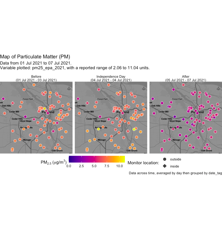
Interestingly, we can see that the days following Independence Day are noticeably lower than the preceding days, and that areas outside of downtown reported higher values on the 4th.
It is worth noting that the date ranges in the above example differ in length. The map function can be customized to add greater or fewer sub-maps, and can create a grid of maps (such as having columns by hour, and rows by date). Furthermore, user-specified settings allow for customization of the date ranges themselves.
The function can also be adjusted to allow for greater contrast in the map background or change the size of individual data points, as well as allow for different map types (such as terrain-based ones) to be used.
Similar maps could be replicated for other time ranges of interest, and be especially useful when analyzing the temporal impact of events that provoke low air quality, such as wildfires (both distant and local). As NCA continues to expand the network of sensors in the Portland area, more data will be available to analyze for the benefit of public health.
Temporal cross-comparisons via heatmaps
Heatmaps use color (typically with what is known as a “continuous” scale) to represent magnitude of a value as it relates to other variables.
Individual monitor
Singular monitors can be explored more in-depth with heatmaps to visualize diurnal (24-hour cycle) patterns or other trends. In this visualization option, only one monitor is selected. The x-axis represents the date, while the y-axis represents the hour. Color (and text labels, if so chosen) are mapped to the reported value.
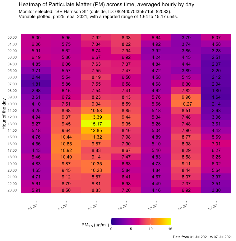
From the above graph, we can see that the highest PM2.5 value for this specific monitor occurred at 1:00 p.m. on July 3rd.
Multiple monitors
This function has the potential to display data from dozens of monitors, which can reveal city-wide temporal patterns in air quality. The following is an example of the function using daily averaged values for a small set of monitors.
Each monitor is listed on the y-axis (with a small separation between “indoor” and “outdoor” monitors, as labeled on the right), and the dates on the x-axis, with each colored box (and the text of each one) on the plot corresponding to the value for that monitor and date.
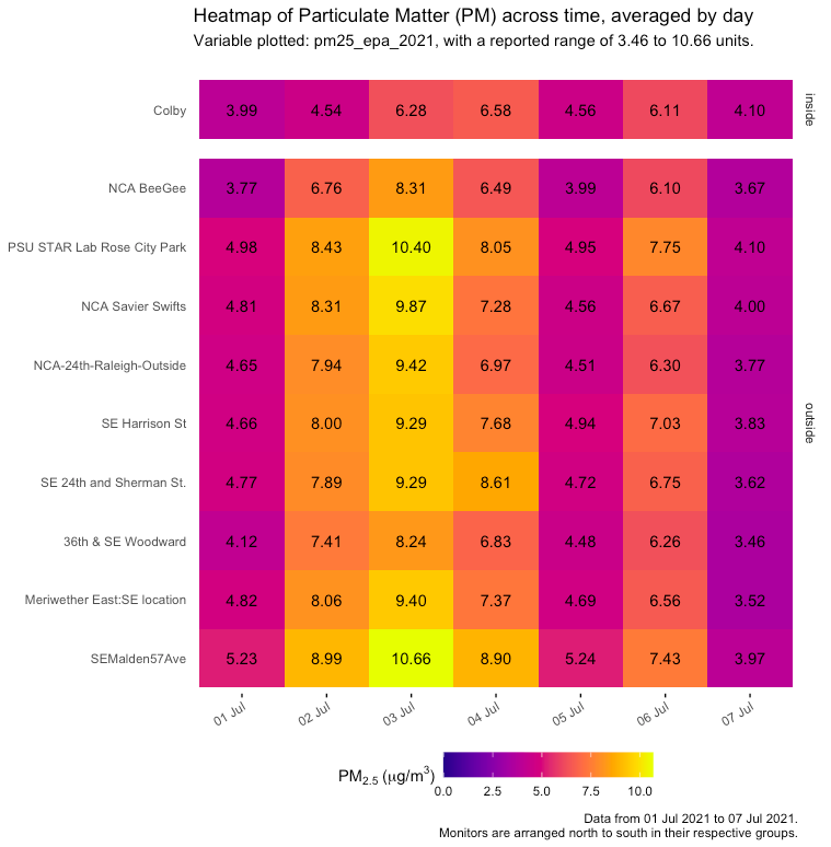
In the above example, we can conclude for the selected monitors that the highest daily average for outdoor monitors occurred on July 3rd.
Below is a much larger, annotated example where all Portland-area monitors (with complete datasets) are plotted. Commentary on how to interpret this visualization has been provided.
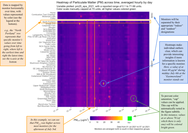
The color “cap” in the above example (see green text box) can also be applied to all other visualization functions shown in this document.
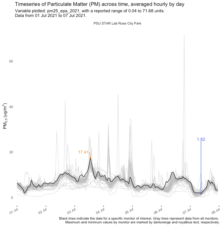
Line graph time series
A classic line graph is a more simplified way to represent temporal data, and can be cleaner than heatmaps.
Below is an example graph of hourly data for monitors, with the monitor of interest indicated at the top. The black line represents the one monitor’s PM value over time, while the gray lines represent the values across time for all other monitors in the data set. Maximum and minimum values for the highlighted monitor are also annotated.
Below is a visualization that represents the same data as above (i.e., hourly by monitor), but with a second monitor highlighted; the addition of points colored by value (as with the other visualization options); and a running average (plotted as if a third monitor).
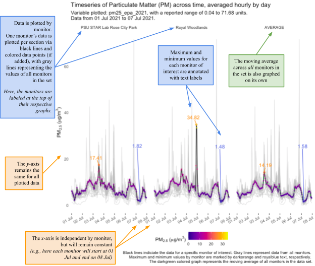
The function can be customized to highlight as many monitors as desired from the data set; only a few are shown here, out of 100+ in the Portland area.