STAD Project Updates: Portland July Visualizations
The following was originally a handout draft approximately halfway through project completion.
Creating data visualization tools for PurpleAir monitors
Gillian McGinnis and Juliane Fry
Reed College
Summer 2021
Goals
Tool Development
PurpleAir has developed an excellent low-cost PM sensor with a convenient online mapping tool (https://www.purpleair.com/map). This online visualization tool is primarily focused on real-time mapping of air quality and limited in terms of small-scale cross-comparisons, the inclusion of external data (e.g. traffic patterns; wind direction/intensity; population data) and the analysis of seasonal averages, historical data, or special cases (such as holidays/events).
This summer, we will write scripts in the open source R language (https://www.r-project.org/about.html) and corresponding RStudio data analysis platform (https://www.rstudio.com/) to expand on existing tools to analyze the data and create clear visualizations. We aim to provide well-documented and reusable tools that can be used to encourage environmental health literacy by enthusiasts and general community members alike.
Since visualization is a powerful method of representing data, we aim for our tools to be clear in interpretation, unbiased in their presentation, and accessible, all while also being visually appealing to users. Careful considerations will be made with the final visualization tools, such as ease of readability, colorblind-safe palettes, and clear labels and annotations.
Research
The planned PurpleAir sensor network expansion in Portland by Neighbors for Clean Air (NCA) provides not only a greater quantity of data for researchers and the general public alike to help better understand their local air quality, but also presents a unique opportunity to participate in ongoing discussions with these local hosts. This will assist in learning more about what local community members are concerned or curious about regarding air quality data, as well as provide opportunities for us as researchers to receive otherwise less accessible data details (such as specific details as to what the sensor is nearby).
NCA’s emphasis on diesel emissions has encouraged us to consider analyses that would involve PM measurements in terms of relations to Portland traffic. Furthermore, we are also investigating the possibility of analyzing meteorological considerations (such as wind and seasonal weather patterns).
The sensors used in PurpleAir units are low-cost, with the tradeoff of not being as accurate as high-cost monitors (such as those used by Federal Reference Monitors [FRMs]). Correction factors for PurpleAir data, like those established by the EPA, are often included when conducting formal analysis. Since these corrections continue to be updated as more research is conducted, portions of our scripts thus far have been dedicated to comparing FRM with a co-located PurpleAir sensor, both with and without these correction factors. We will establish best practices for how to correct data from the Portland plume.
We look forward to working with community members as well as state, county, and local agency staff to co-create new scientific knowledge about Portland’s air quality, by sharing our results as we proceed and acting on suggestions from these partners for new analyses and/or visualization tools.
Documentation
All data analysis will be conducted in the R programming language via RStudio, and annotated with in-code comments and corresponding documentation.
The final scripts for reproducible analyses are to be published on a publicly accessible GitHub repository.
Example figures
The following pages contain some examples of figures we have created for using PM2.5 data.
Scripts allow for PurpleAir data to be pulled from specified areas of interest (even from regions outside of Portland) over defined periods of time. Alternatively, data that has been directly downloaded from PurpleAir’s existing download tool can be uploaded. From there, scripts will arrange and apply correction factors (sourced from the EPA and LRAPA) to the data, and can group by specified categories (such as hourly groupings or date sub-ranges of interest). Then, the results can be explored with visualization functions. FRM data from the DEQ can also be uploaded and visualized.
Examples of some figures are in the following pages, using data from the Portland area in early July of 2021.
Spatio-Temporal Comparisons
The following maps display comparisons of EPA-corrected PurpleAir PM2.5 data for both indoor and outdoor sensors in the Portland area during Independence Day 2021 for different times of the day.
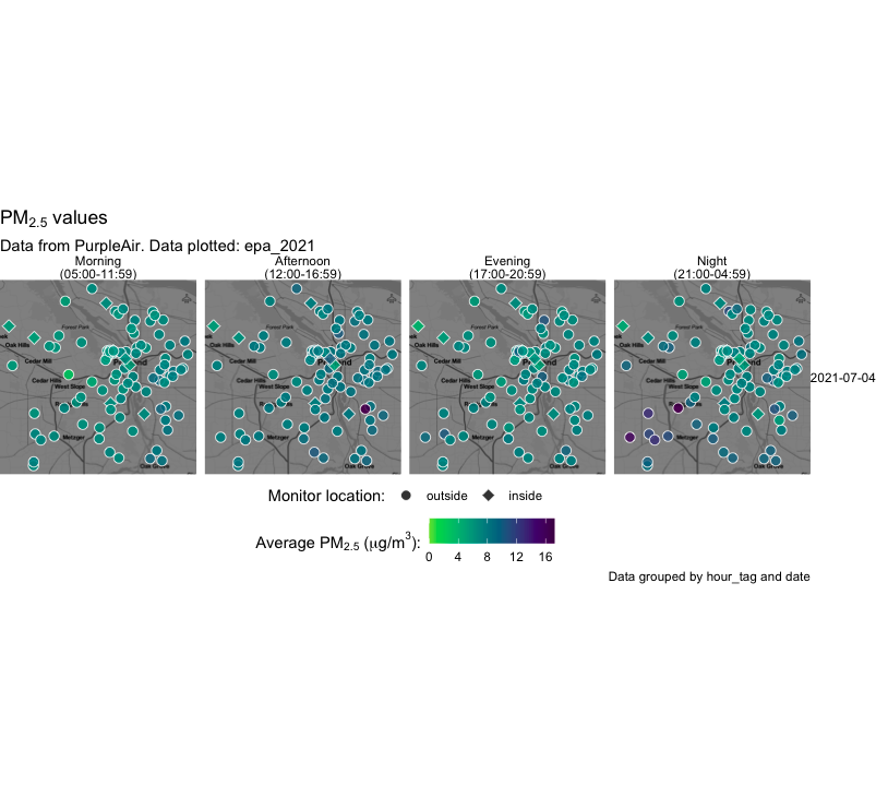
The function that has been written to create the above visualization can also be adjusted to allow for greater contrast in the map background or change the size of individual data points.
The map can also be customized to add greater or fewer sub-maps, and can create a grid of maps (such as having columns by hour, and rows by date).
Similar maps could be replicated for other time ranges of interest, and be especially useful when analyzing the temporal impact of events that provoke low air quality, such as wildfires (both distant and local). As NCA continues to expand the network of sensors in the Portland area, more data will be available to analyze for the benefit of public health.
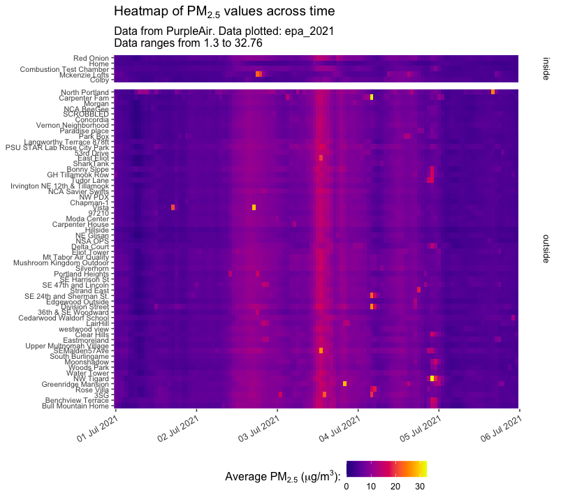
Temporal cross-comparisons via heatmaps
Below are examples of EPA-corrected PM values reported for selected monitors before, during, and after Independence Day 2021, averaged hourly.
Multiple monitors
This function has the potential to display data from dozens of monitors, which can reveal city-wide temporal patterns in air quality. Below is an example where Portland-based monitors which had data for all hours of interest have been mapped (arranged on the y-axis such that monitors are reported north to south in their respective indoor/outdoor sections):
The function can also be applied to smaller datasets, such as specified monitors of interest and daily-averaged data:
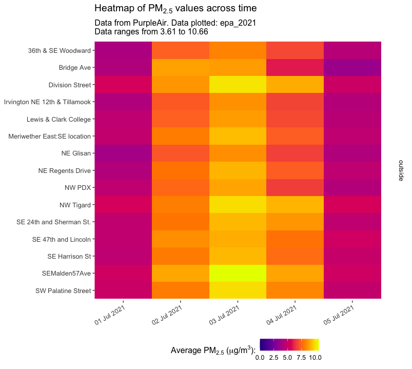
Individual monitors
Singular monitors can be explored more in-depth with heatmaps to visualize diurnal (24-hour cycle) patterns or other trends:
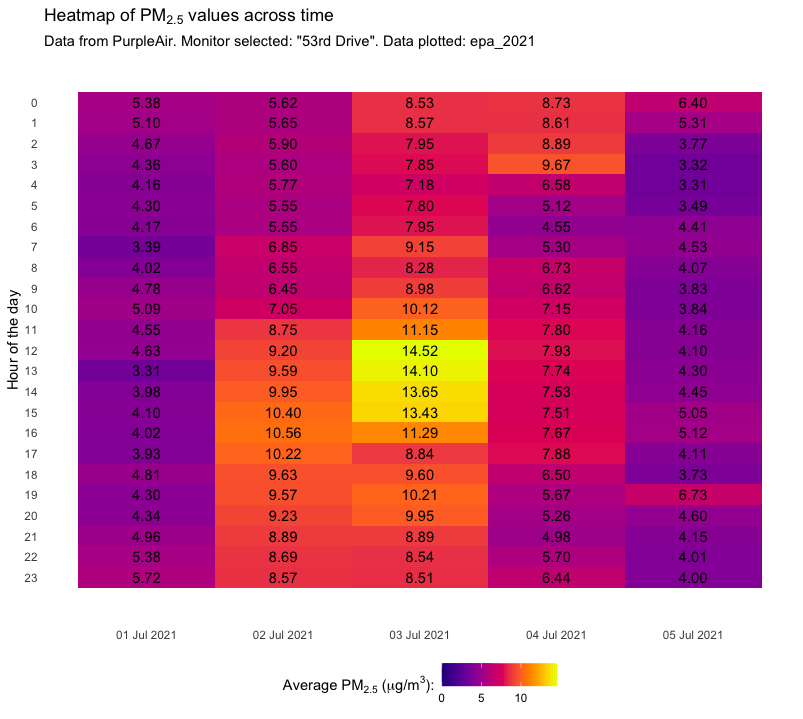
Color can, however, be limited in terms of accessibility and prove difficult when extreme values are reported (such as during wildfires). We anticipate making alternative visualization options for this temporal data, such as more “traditional” visuals like line graphs and scatterplots, and visuals that more clearly consider outliers such as boxplots or violin plots.
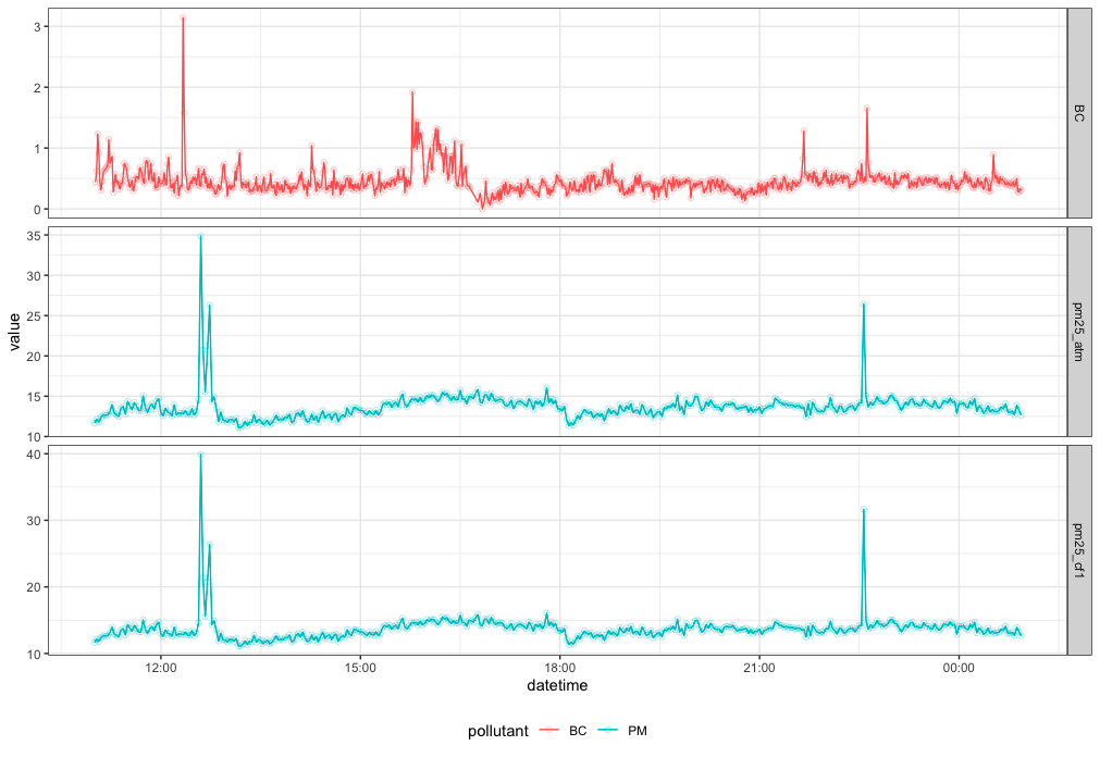
Inclusion of external data
Below is a draft of an example figure that can be created when external data is brought in. Here, a half-day’s worth of data from a low-cost black carbon (“BC”) and raw data from a nearby PA monitor are mapped temporarily in parallel.