STAD Analysis Introduction: Project Overview and Goals
The following was originally a handout I created for an ACSI (Advisory Committee on Sustainability and Innovation) Air Toxins Subcommittee meeting.
Portland particulate matter (PM) monitoring with PurpleAir sensors: creating data visualization tools for air quality
Gillian McGinnis and Juliane Fry
Reed College
Summer 2021
Goals
Tool Development
PurpleAir has developed an excellent low-cost PM sensor with a convenient online mapping tool. This online visualization tool is primarily focused on real-time mapping of air quality and limited in terms of small-scale cross-comparisons, the inclusion of external data (e.g. traffic patterns; wind direction/intensity; population data) and the analysis of seasonal averages, historical data, or special cases (such as holidays/events).
This summer, we will write scripts in the open source R language (https://www.r-project.org/about.html) and corresponding RStudio data analysis platform (https://www.rstudio.com/) to expand on existing tools to analyze the data and create clear visualizations. We aim to provide well-documented and reusable tools that can be used to encourage environmental health literacy by enthusiasts and general community members alike.
Since visualization is a powerful method of representing data, we aim for our tools to be clear in interpretation, unbiased in their presentation, and accessible, all while also being visually appealing to users. Careful considerations will be made with the final visualization tools, such as ease of readability, colorblind-safe palettes, and clear labels and annotations.
Research
The planned PurpleAir sensor network expansion in Portland by Neighbors for Clean Air (NCA) provides not only a greater quantity of data for researchers and the general public alike to help better understand their local air quality, but also presents a unique opportunity to participate in ongoing discussions with these local hosts. This will assist in learning more about what local community members are concerned or curious about regarding air quality data, as well as provide opportunities for us as researchers to receive otherwise less accessible data details (such as specific details as to what the sensor is nearby).
NCA’s emphasis on diesel emissions has encouraged us to consider analyses that would involve PM measurements in terms of relations to Portland traffic. Furthermore, we are also investigating the possibility of analyzing meteorological considerations (such as wind and seasonal weather patterns).
The sensors used in PurpleAir units are low-cost, with the tradeoff of not being as accurate as high-cost monitors (such as those used by Federal Reference Monitors [FRMs]). Correction factors for PurpleAir data, like those established by the EPA, are often included when conducting formal analysis. Since these corrections continue to be updated as more research is conducted, portions of our scripts thus far have been dedicated to comparing FRM with a co-located PurpleAir sensor, both with and without these correction factors. We will establish best practices for how to correct data from the Portland plume.
We look forward to working with community members as well as state, county, and local agency staff to co-create new scientific knowledge about Portland’s air quality, by sharing our results as we proceed and acting on suggestions from these partners for new analyses and/or visualization tools.
Documentation
All data analysis will be conducted in the R programming language via RStudio, and annotated with in-code comments and corresponding documentation.
Files from our winter work (with limited commentary) are currently in a publicly accessible GitHub repository: https://github.com/gmcginnis/PurpleAir_Portland_2021
Further analysis being conducted on the data is also being compiled in the repository. Finalized versions of the tools and documentation will likely be placed in a separate repository for clarity and ease of access.
Example figures
The following pages contain some examples of figures we have created for using PM2.5 data. More figures are available in the aforementioned repository.
Mapping PurpleAir data
The following map shows spatio-temporal comparisons of PurpleAir PM2.5 data for both indoor and outdoor sensors in the Portland area before, during, and after the mid-September 2020 wildfires.
Note: color scale differs from that of the AQI; we are currently working on revising this
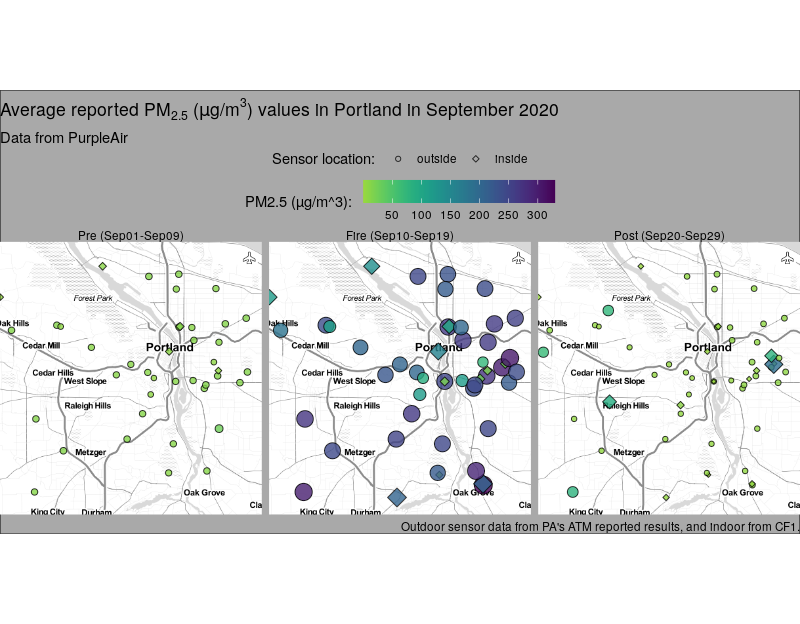
Similar maps could be replicated for other time ranges of interest, and be especially useful when analyzing the temporal impact of events that provoke low air quality, such as wildfires (both distant and local), and Independence Day.
We expect to bring in other outside data sources in order to better understand local air quality demographics and to determine which tools could be beneficial to the public.
It should be noted that in the Portland area, few PurpleAir sensors reside east of Interstate 205. With NCA’s current distribution plan to expand the network of sensors in the Portland area, more data will be available to analyze for the benefit of public health.
Comparing PurpleAir sensors and FRMs during the Sept 2020 wildfires
The figure below compares PM2.5 data in SE Lafayette from the DEQ FRM (y-axis) and a STAR lab co-located PurpleAir sensor’s raw ATM outputs (x-axis) during the aforementioned time ranges.
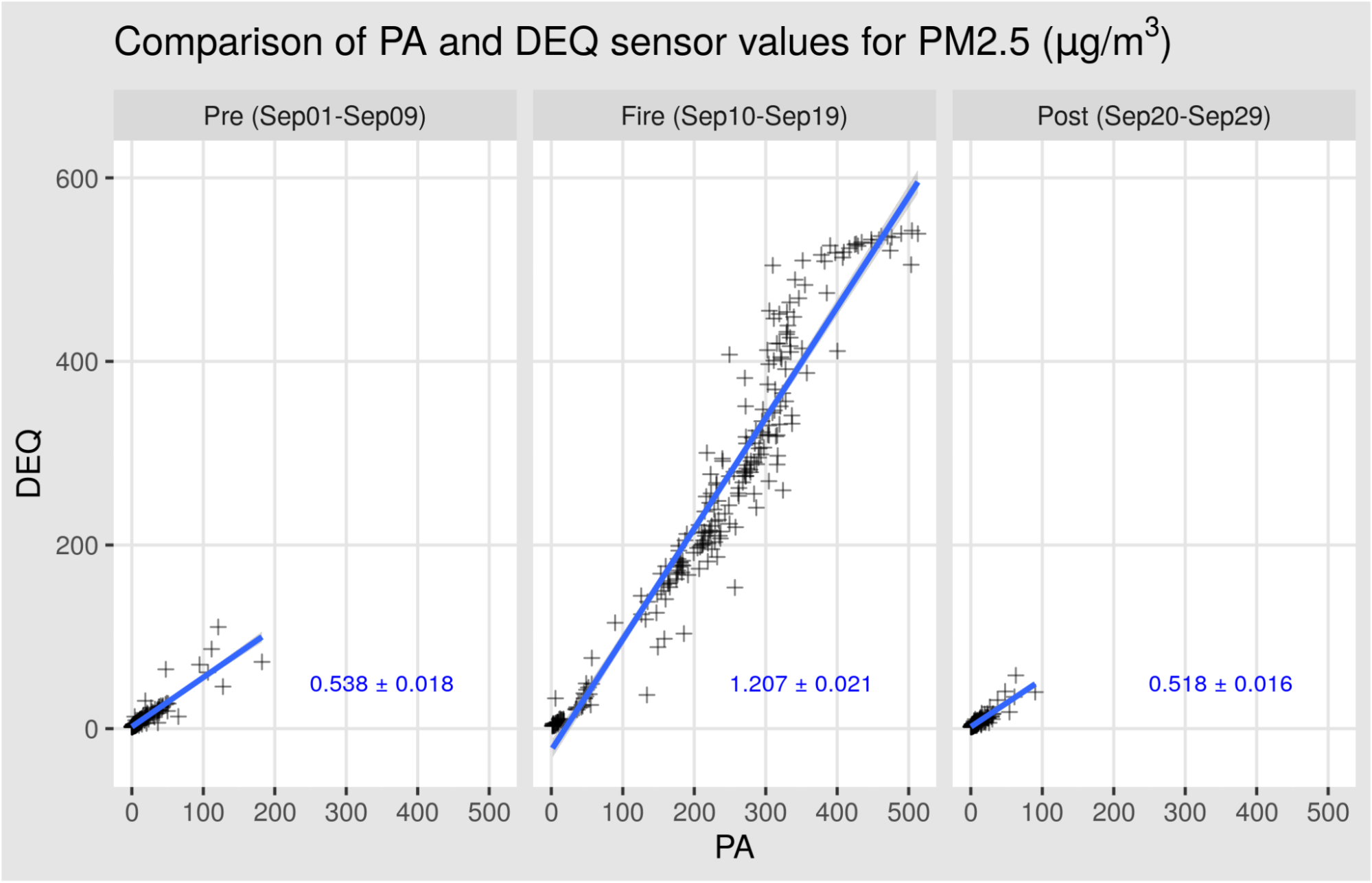
These results demonstrate the overestimation of the PurpleAir sensor at low PM2.5 concentrations, but underestimations during times of significant smoke plume.
We are currently working on the implementation of past and current EPA correction factors, which are documented in their online Air Sensor Toolbox: https://www.epa.gov/air-sensor-toolbox
Previous iterations of the correction factor had not yet included separate high-PM2.5 correction equations. As of late 2020, published equations now provide separate equations for adjusting high-PM2.5 values. Such adjustments are important when conducting wildfire studies.