April Fool's Data Visualization Contest
In late March of 2021, I participated in an April Fool’s Day themed data visualization competition hosted by the Reed College Math Department. Participants worked in small groups or individually to intentionally create the ugliest visualization using data from previous Tidy Tuesday collections. Three data sets were presented, dealing with YouTube, the SuperBowl, and popstar lyrics. All groups had 45 minutes to complete their visualizations, and winners were selected by audience vote.
My project partner and I chose to use filtered data from the lyric set, opting to analyze that of sing-songwriter Beyoncé Giselle Knowles-Carter.
Our final visualization, shown below, was voted to be the winner for “Ugliest Data Visualization”.
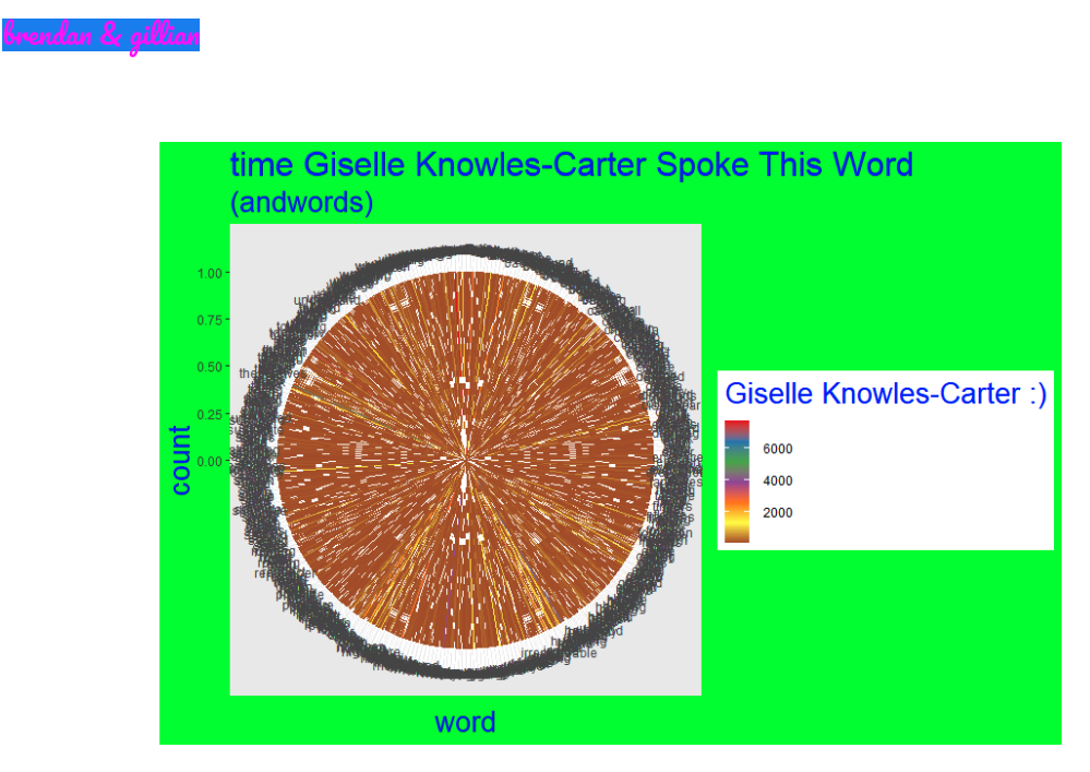
Despite being programmed to be a circular barplot, the sheer quantity of words prevents any valuable information from being gathered from the visualization. Furthermore, the cause of the white stripes in these bars are fully unknown. Fortunately, R did not crash too many times while processing this data.