College Enrollment Data Visualization Contest
In early November of 2020, I participated in a data visualization competition hosted by the Reed College Math Department in which participants worked in small groups or individually to create a visualization for data from Tuition Tracker. Data sets were revealed on November 10th and final presentations were conducted on November 16th. Winners were determined by audience votes.
I chose to work alone; my repository for the project is available on my GitHub here.
Challenges faced included the size of the data and aesthetic accessibility.
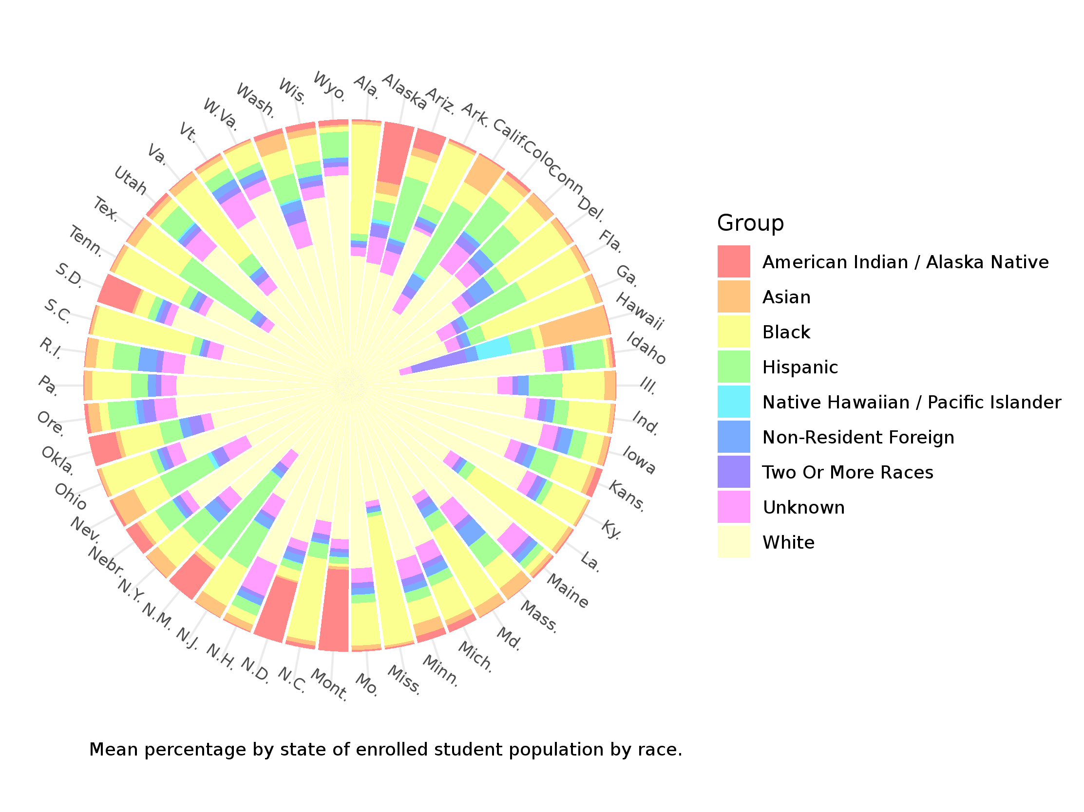
My final visualization, shown below, was selected for the “Most Visually Appealing Visualization” award, and was the only visualization selected that was not created by a team.